
Fake zasshi: how to check counterfeit Weekly Shōnen Jump
Fake zasshi: 40 photographs of Dragon Ball, One Piece, Naruto and Hunter × Hunter, official facsimiles and Attack on Titan reports. Checks and sources.
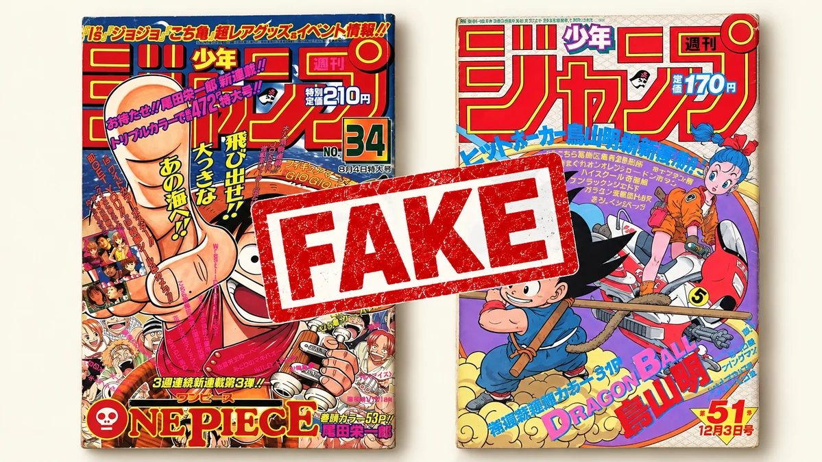
Title, language, publisher, edition and issue. Always compare the same publication.
Cross-check printing, margins, colophon and construction. One feature cannot authenticate a copy.
Ask for clear photographs of the actual copy, including inside. Tap guide photographs to enlarge them.
Which magazine are you looking for?
When you look for the magazine in which a story began, the year and issue number matter as much as the cover. A familiar cover may belong to a period original, an official facsimile or a counterfeit.
We start with four Weekly Shōnen Jump issues documented in Ben Schwank’s guide, updated on 16 June 2024. Its 38 photographs each have an explanation of the detail to inspect. Additional references and an Attack on Titan report follow. [1] Each comparison concerns the specified issue, not every magazine or tankōbon from the series.
Schwank describes encountering Dragon Ball fakes from late 2021: Mercari Japan listings, copies relisted on eBay, and two counterfeits he bought himself. He also reports copies dirtied or damaged to look older. Wear alone is therefore no reassurance.
This is a collector’s account of the copies he examined. Colour, print and paper comparisons concern those specimens; a blurry photograph or different lighting may hide or exaggerate differences. Counterfeits also change: the 2024 guide already records corrections to some known defects.
| Series | Publication | Evidence |
|---|---|---|
| Dragon Ball | Weekly Shōnen Jump · 1984 #51 | Official notice + comparisons |
| One Piece | Weekly Shōnen Jump · 1997 #34 | Photographic comparisons |
| Hunter × Hunter | Weekly Shōnen Jump · 1998 #14 | Comparisons + 2025 first-hand report |
| Naruto | Weekly Shōnen Jump · 1999 #43 | Photographic comparisons |
| Attack on Titan | Bessatsu Shōnen Magazine · October 2009 | Report; photographs not verified |
Dragon Ball · Jump 1984 #51
This issue is also covered by a Shueisha warning. On 9 November 2022, the publisher described examined counterfeits that were glued, unlike the stapled original. [2] However, in the PDF updated on 16 June 2024, Schwank reports staples added to some fakes. [1]
Start with the small spot on Goku’s staff near the cord: visible in the photographed original, missing in the counterfeit. The staff also changes from darker, varied browns to a lighter, uniform shade. The cover comparison shows different purple background and blue clothing tones too.
Enlargements offer other checks: grainier printing around the issue number, the B in DRAGON BALL and the back cover; differing spine lettering; and a printing error in the purple lettering of the bottom panel on page two. The page-edge photographs also compare paper appearance and construction.
Staples are a check, not a verdict. Missing staples are a difference to investigate; present staples still require checking the print and artwork. Look for agreement across several details.
The two covers
[1]01 / 01
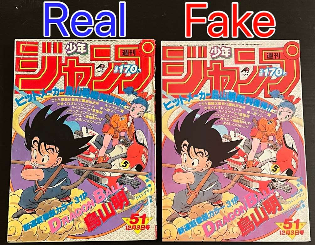
Genuine on the left, counterfeit on the right. Schwank compares the purple background and the blue of Goku’s clothes: their shades differ in these copies. Colour alone needs care because lighting and photography can change its appearance.
The small spot on Goku’s staff
[1]01 / 02
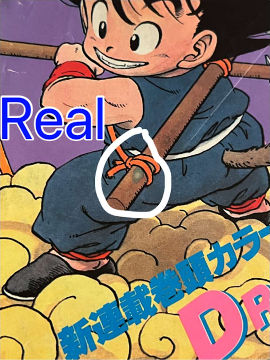
The white circle marks a small spot on the staff near the tied cord. The genuine illustration also uses several darker shades of brown. The feature to look for is that spot, not a protrusion in the staff.
02 / 02
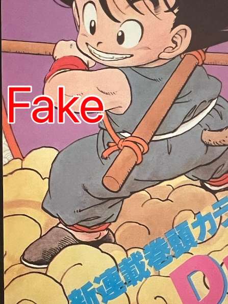
The counterfeit is missing the small spot visible on the genuine staff. The wood is also rendered in a lighter, more uniform brown. These are two separate differences identified by the source in the same detail.
Staples: a check that needs updating
[1]01 / 02
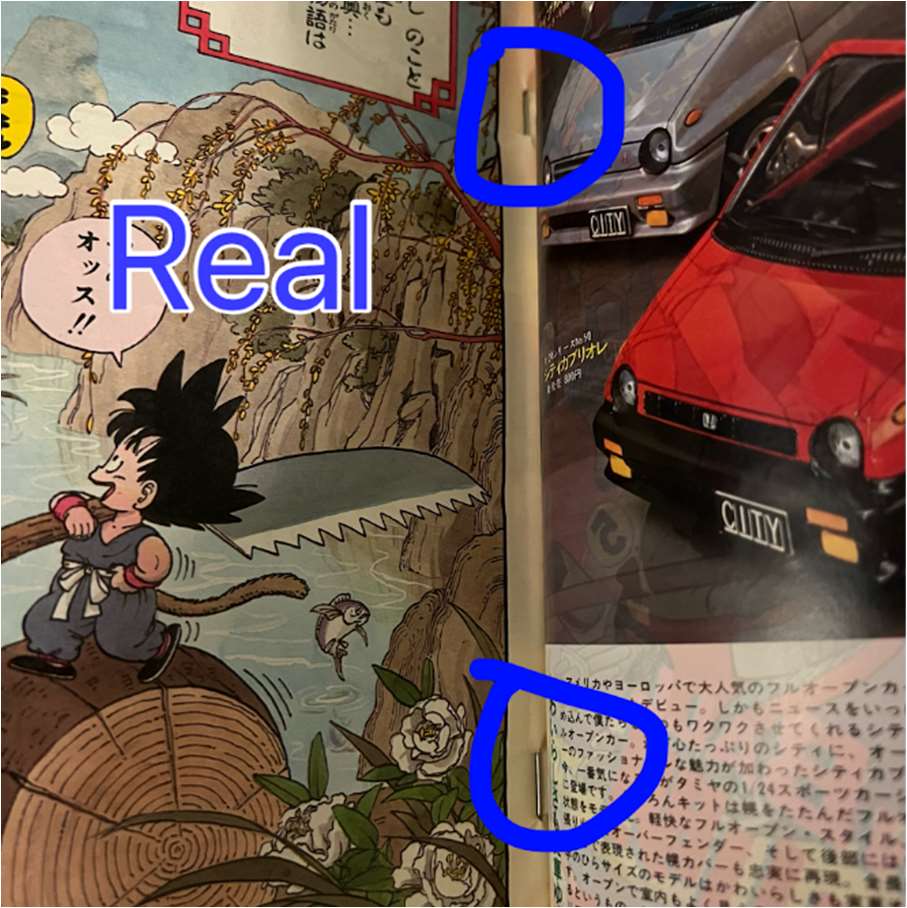
Behind the genuine front cover, staples are visible in the blue-circled areas. This is useful to check, but their presence is insufficient: Schwank’s 16 June 2024 update reports staples added to some counterfeits too.
02 / 02
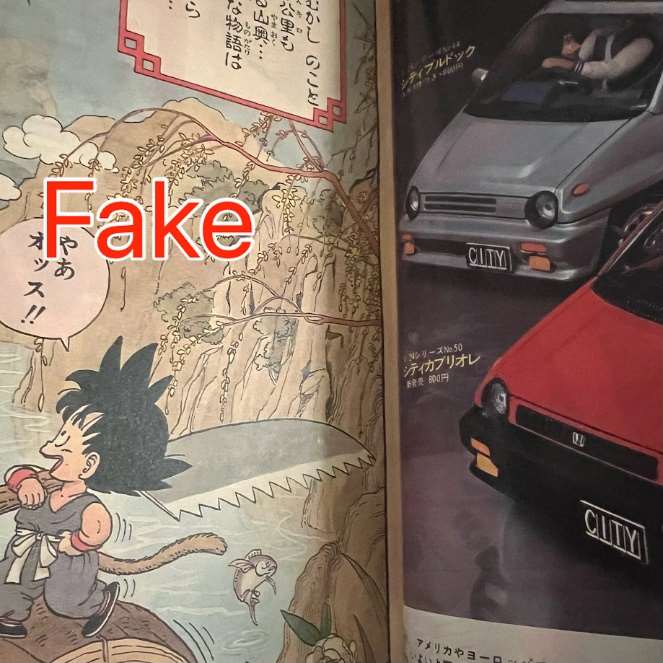
The photographed counterfeit lacks the staples visible in the genuine copy. It represents the initially reported type. It is not a template for every fake: by June 2024, the source was already describing copies with added staples.
The panel and unusual lettering
[1]01 / 02
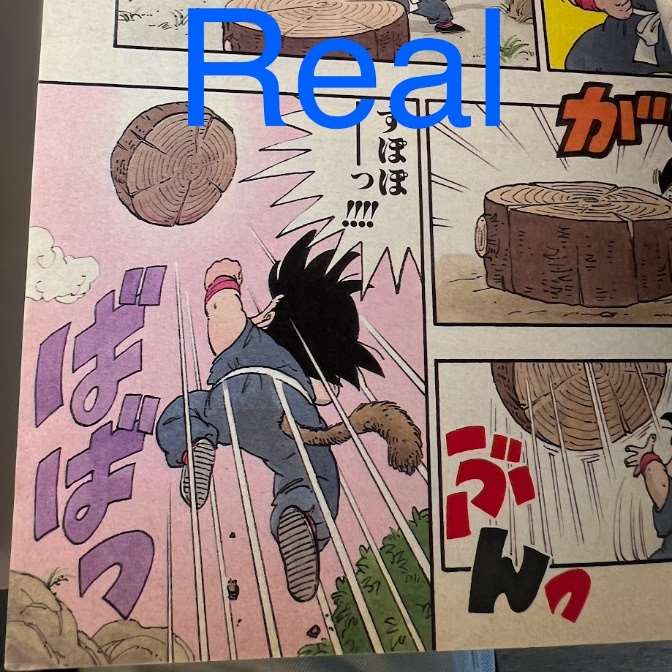
This is the bottom panel on the genuine second page. Use the large purple lettering to Goku’s left as the reference: some strokes differ in the counterfeit comparison.
02 / 02
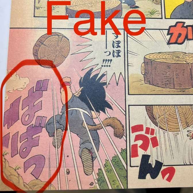
The red circle highlights the printing error in the counterfeit’s purple lettering. Compare the shapes of its strokes with the genuine example: the issue concerns the reproduced drawing, not just the shade of purple.
Explore issue number, lettering, edges and spine · 10 photos
The issue number on the cover
[1]01 / 02
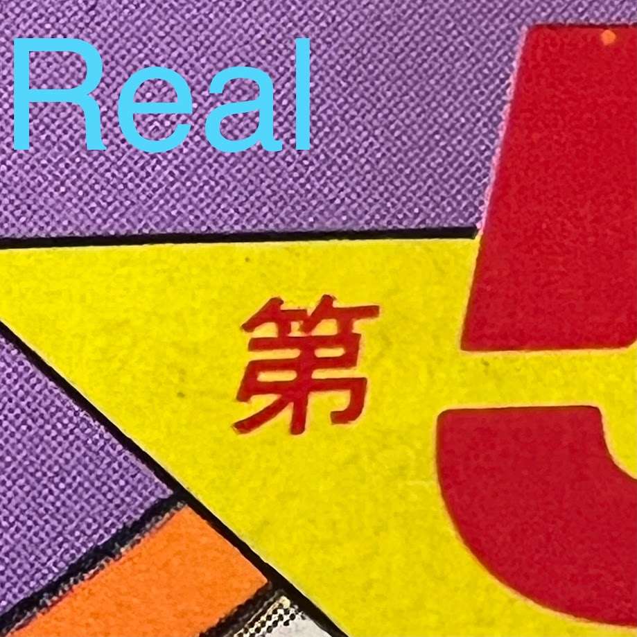
This is the issue number on the genuine copy. Compare the character edges and coloured areas with the counterfeit to assess the fineness or graininess of the print, rather than looking for a different number.
02 / 02
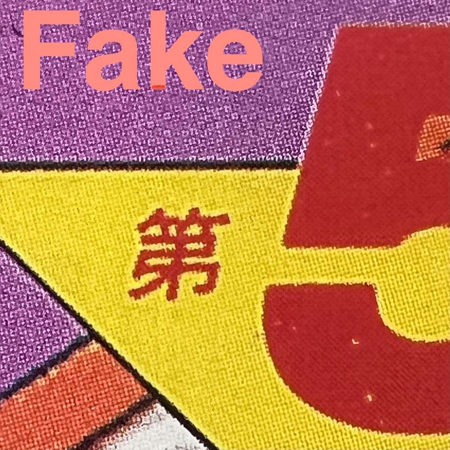
The counterfeit detail looks grainier. Look at the red character on yellow and at the edges of the numerals. Compare these areas with the genuine example at the same scale.
The letter B
[1]01 / 02

The B in DRAGON BALL on the genuine copy is another print-quality example. The pink letter and its blue outline appear more even than in the counterfeit detail.
02 / 02
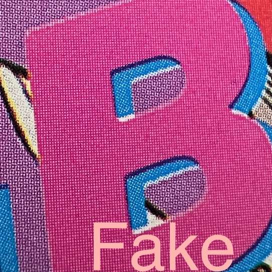
The counterfeit B also shows a more conspicuous, uneven print texture. This enlargement illustrates the same increased graininess seen around the issue number.
Lettering on the back
[1]01 / 02
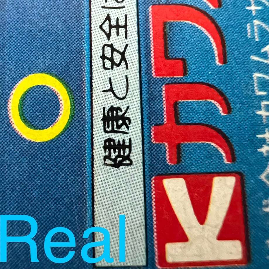
The comparison continues on the genuine back cover. Focus on the small black characters in the pale strip and the edges of the coloured lettering, then compare them with the counterfeit.
02 / 02
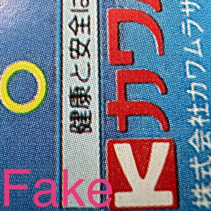
The counterfeit back cover also has grainier printing. The small characters in the pale strip lose definition, and letter edges look less clean than on the genuine copy.
Page edges and construction
[1]01 / 03
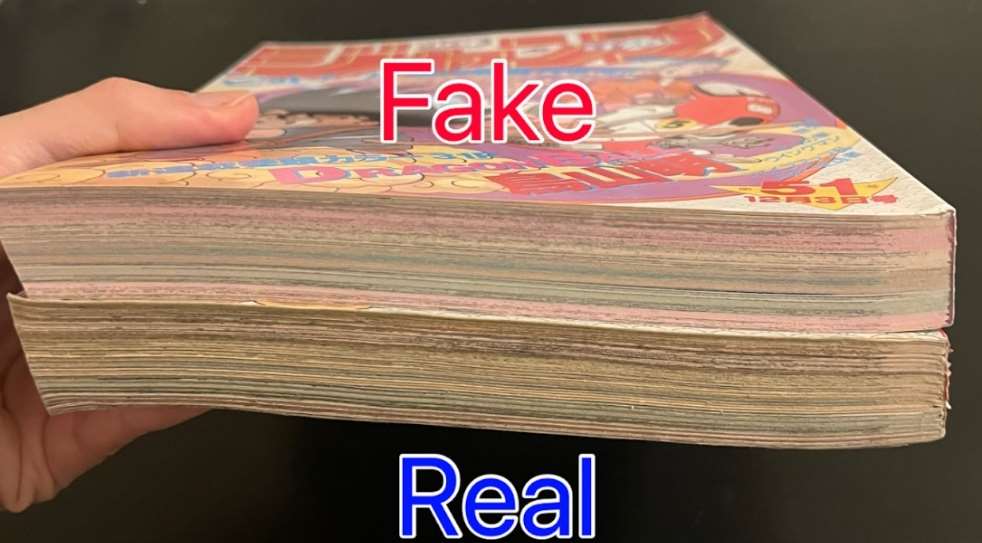
The counterfeit is above the genuine copy. Schwank describes its paper as looking and smelling like new newsprint, unlike the aged paper of the 1984 copy. Smell cannot be checked in a photograph, and yellowing alone does not establish age or authenticity.
02 / 03
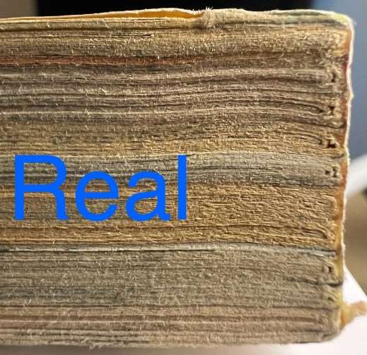
This close-up shows the genuine copy near the spine. The PDF pairs it with the counterfeit to show differences in how the page block is bound. The source provides no measurements or rule applying to every magazine.
03 / 03
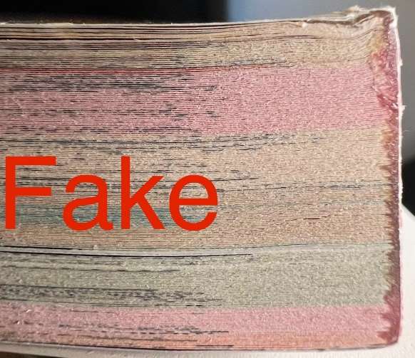
This shows the corresponding area of the counterfeit. Compare the profile and arrangement of the pages near the spine with the genuine photograph: the source flags a construction difference as well as a different paper appearance.
The spine
[1]01 / 01
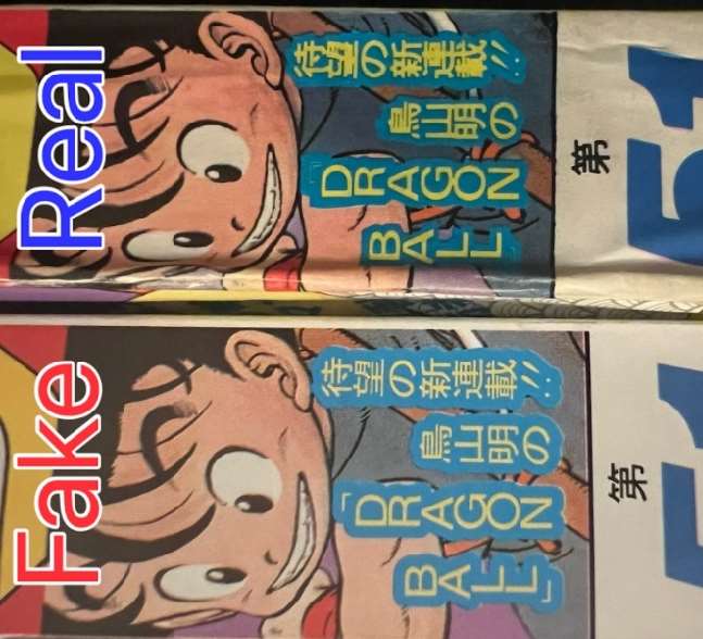
Genuine above, counterfeit below. The PDF notes that the spine lettering does not match. Compare the shapes and proportions of the yellow lettering in the blue panel, rather than only the cover colour.
Naruto · Jump 1999 #43
Look at Naruto’s smile: the photographed counterfeit has a small black mark on the lower teeth. The close-up shows only that fake. Schwank reports finding it on every counterfeit he examined by June 2024; that does not mean every later fake must have it. [1]
The PDF also reports darker greens and pinks on the cover and spine, and grainier small lettering at the top. The backs look similar from a distance, but enlarging “1999 Printed” and the 220-yen price reveals differences in edges and letterforms.
Check the magazine from the side too. An illustrated interior page projects slightly from the photographed original, but not the fake. Close-ups near the spine also show differences in the page-block construction. If you find a mark on the teeth, compare these other features before identifying it as the same defect.
Comparing the covers
[1]01 / 01
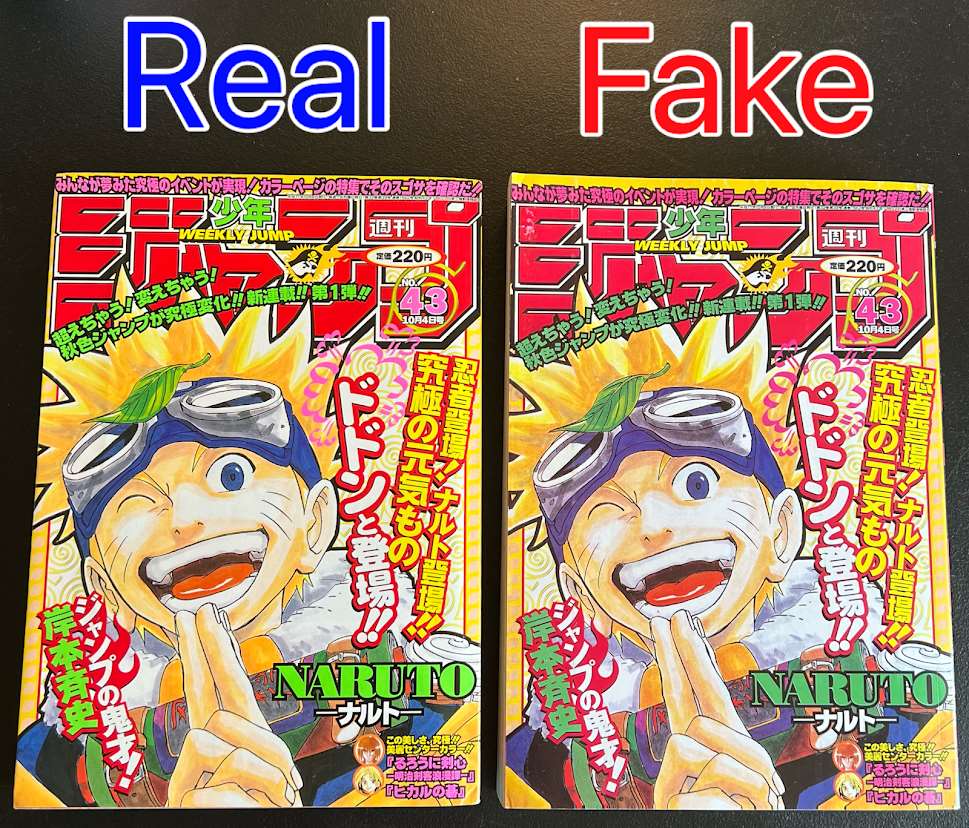
Genuine on the left, counterfeit on the right. Schwank points out darker light-green and pink tones in the counterfeit. Cross-check colour differences with the print details shown below.
The small text at the top
[1]01 / 02
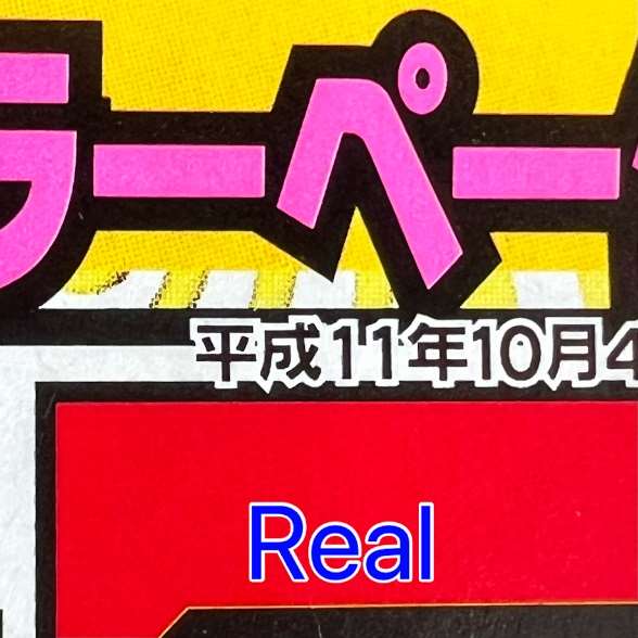
The small Japanese date line at the top has more defined edges on the genuine copy. Focus on the pale characters outlined in black and compare them with the same area on the counterfeit.
02 / 02
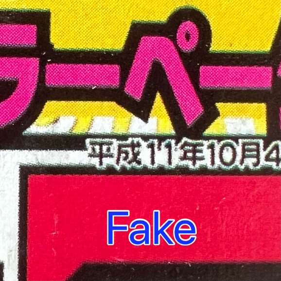
The counterfeit’s small top lettering looks grainier and less distinct. That is the PDF’s point: a correct date alone is insufficient; how it is reproduced also matters.
The black mark on the teeth
[1]01 / 01
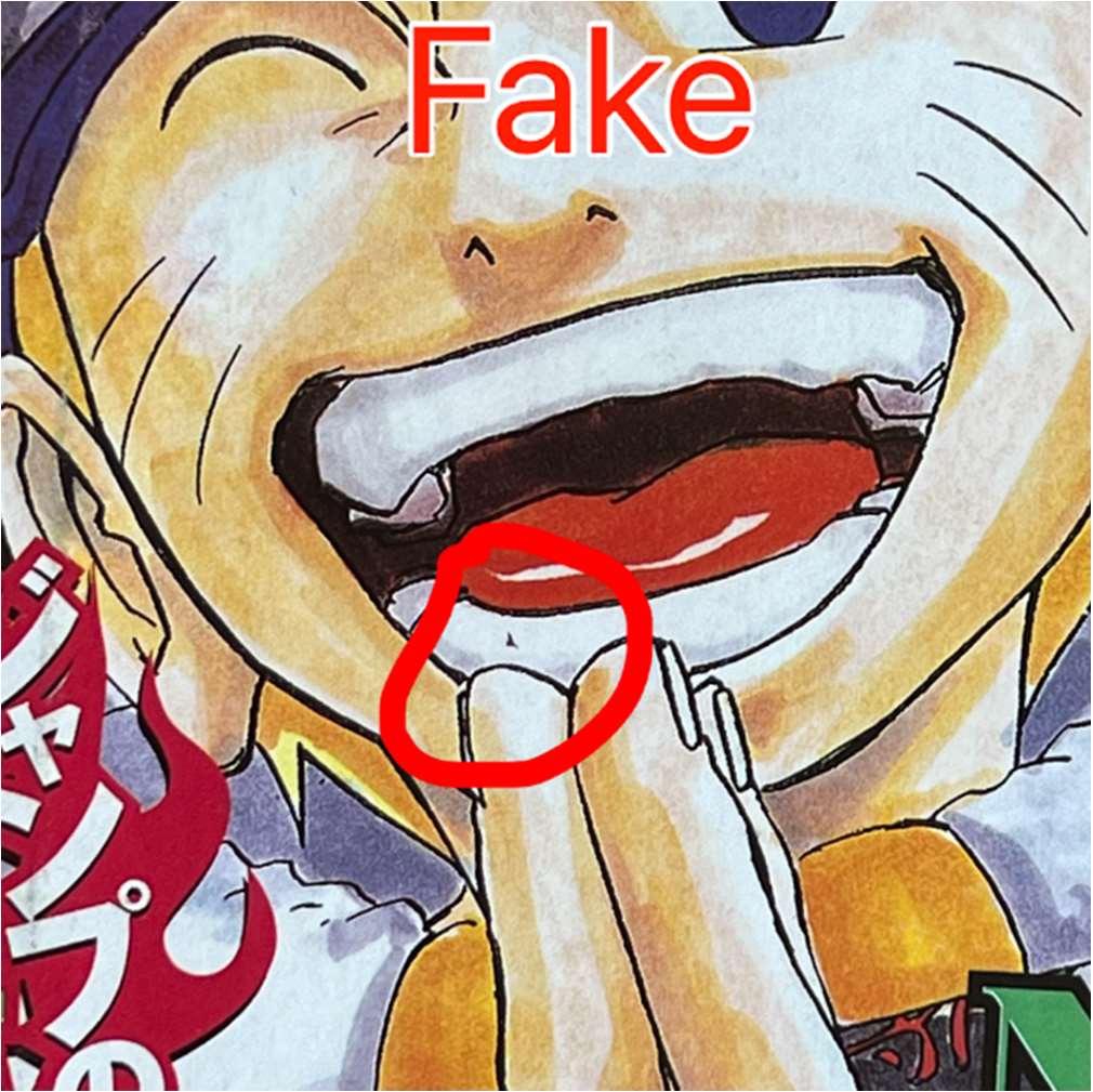
The red circle marks a small black defect on Naruto’s lower teeth. This photograph shows only the counterfeit. Schwank reports seeing it on every fake he examined by June 2024; that describes his sample, not a guarantee about later copies.
Explore binding, back cover and price · 9 photos
The interior page projecting from the fore-edge
[1]01 / 01
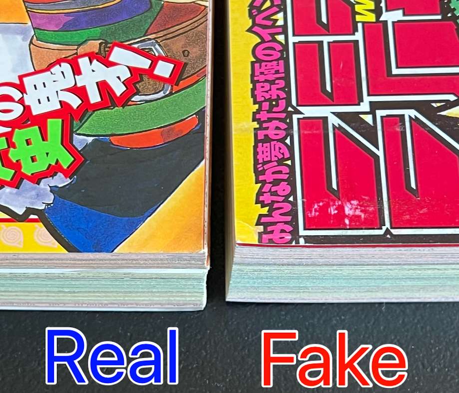
On the genuine copy at left, an illustrated page projects slightly from the fore-edge. The counterfeit at right lacks this projection. The source calls it a splash page: an illustrated interior page, not the cover.
The spine
[1]01 / 01
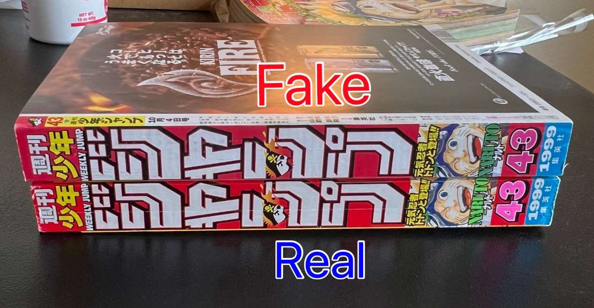
Note the order: counterfeit above, genuine below. The source also identifies darker greens and pinks on the fake spine. Compare the issue number 43 and the small Naruto figure in the same areas.
External binding details
[1]01 / 02
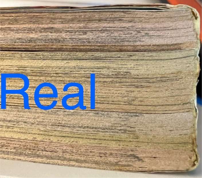
This photograph shows the genuine copy near the spine, providing a reference for the arrangement and binding of the pages. The PDF identifies a construction difference from the counterfeit without defining a standard measurement.
02 / 02
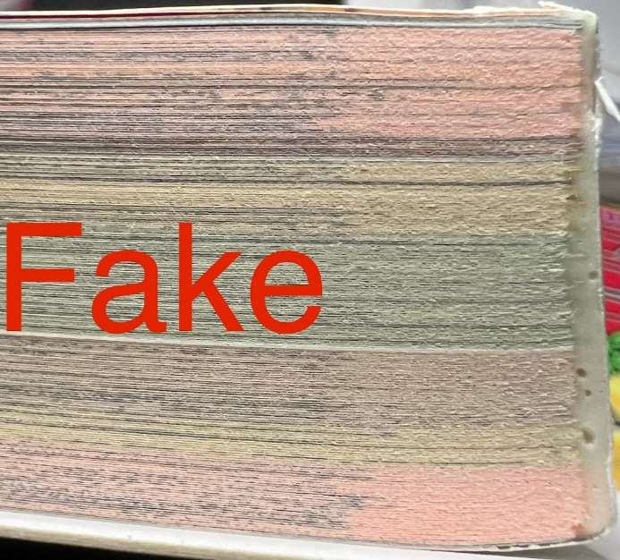
This is the corresponding counterfeit detail. Compare the page-block profile with the genuine example beside it. The source does not establish a glue-quantity or paper-colour test that can determine authenticity on its own.
The back cover
[1]01 / 01
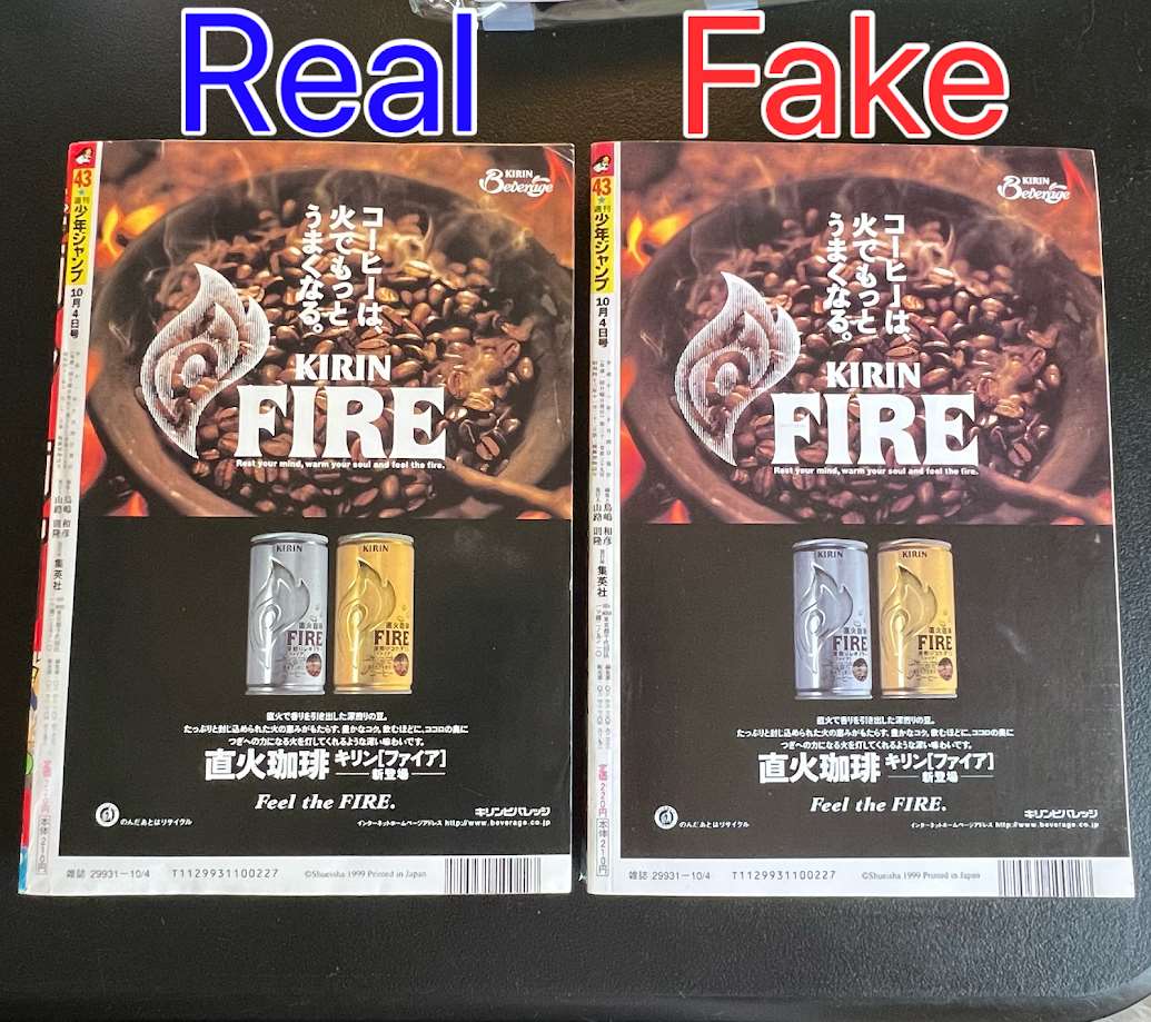
From a distance the back covers look very similar: genuine left, counterfeit right. The PDF recommends magnifying the text and images because the counterfeit is grainier and some letterforms differ.
The “1999 Printed” wording
[1]01 / 02
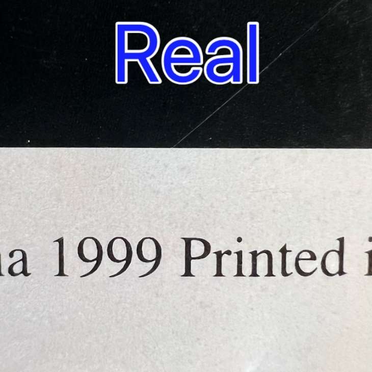
The “1999 Printed” wording on the genuine back cover has sharper edges. Compare its rendering with the counterfeit: the wording appears on both copies and does not itself prove authenticity.
02 / 02
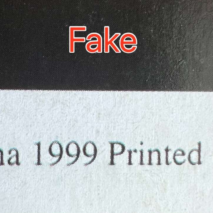
The same wording on the counterfeit looks grainier and less precise. Compare letter and numeral edges at the same scale; the presence of “Printed” is not the distinction.
The 220-yen price
[1]01 / 02
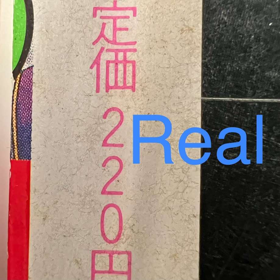
The genuine 220-yen price is printed in pink with relatively fine strokes. Compare the character and numeral forms; the amount itself is also reproduced on the counterfeit.
02 / 02
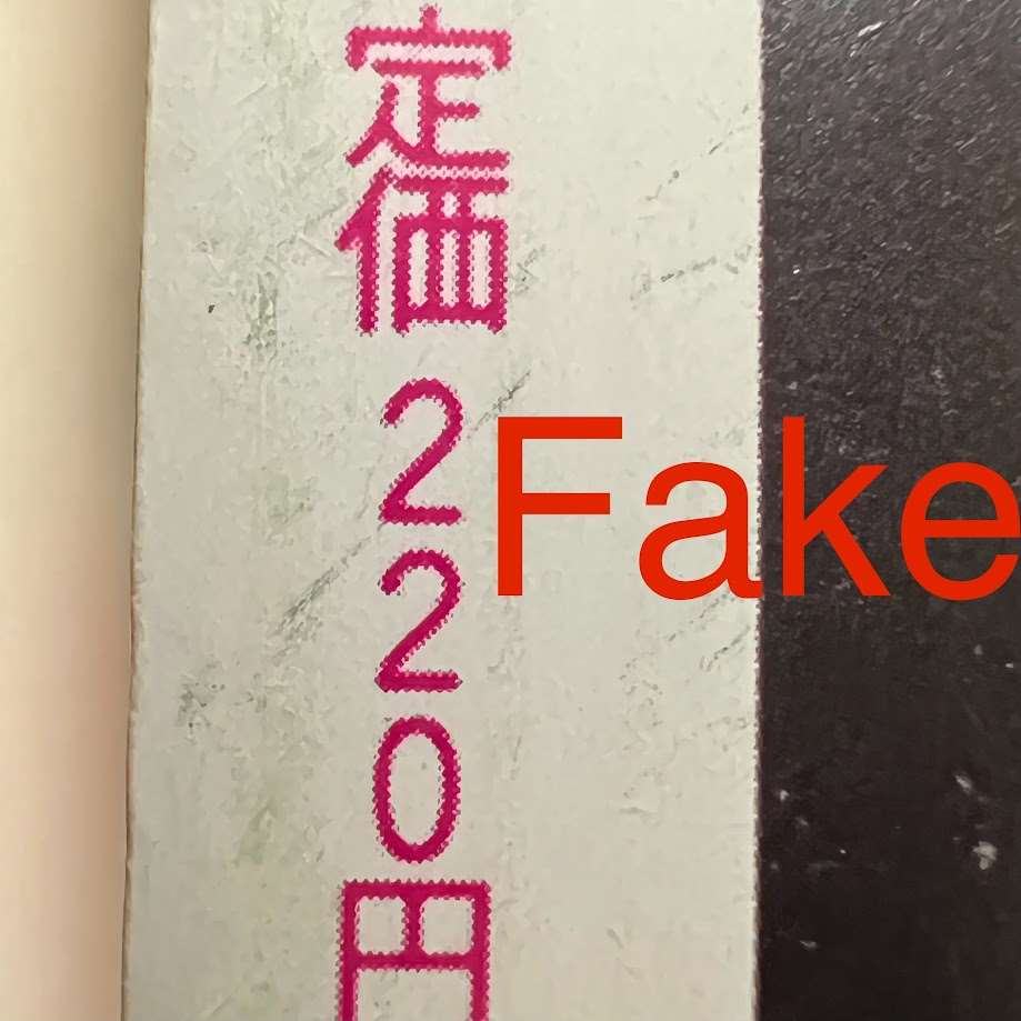
The counterfeit price characters are heavier and grainier. This detail illustrates both the printing difference and the differing letterforms described in the PDF.
Hunter × Hunter · Jump 1998 #14
Schwank’s counterfeit comparison has a badly off-centre cover. Look at the left margin: how much artwork remains visible and where it meets the edge. He also reports different colours, grainier printing and paper that looks and smells like new newsprint. A frontal photograph helps assess centring; it cannot establish smell. [1]
The other two photographs come from Andrew, author of Obscure Manga, who described buying a counterfeit in February 2025. They show the cover and spine of that same copy. He describes the small Gon on the spine as blurry compared with the cover artwork. The published photographs are low-resolution: they illustrate his account, but are not sharp enough to judge another copy’s print quality. [3]
The left margin
[1]01 / 02
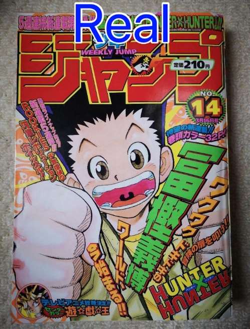
This genuine cover is the comparison reference. Look at the artwork along the left margin and the title’s position relative to the edge, then compare the strongly off-centre counterfeit beside it.
02 / 02
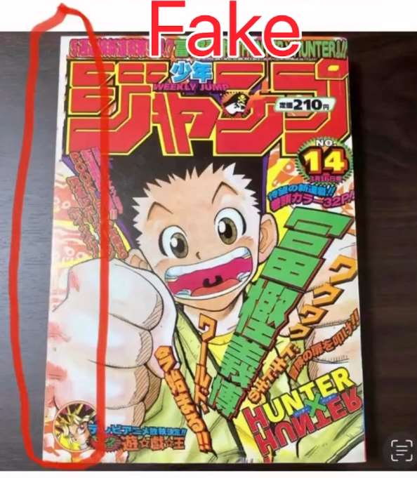
The red outline follows the left side of the badly off-centre counterfeit cover. Schwank also reports different colours, grainier imagery and paper that looks and smells like new newsprint; this single photograph cannot establish all those observations.
The copy reported in 2025: cover
[3]01 / 01

This is the cover of the fake Andrew described in 2025. The published photograph is small: it identifies the copy, but enlargement cannot recover missing detail. Checking another copy requires clearer photographs.
The copy reported in 2025: spine
[3]01 / 01
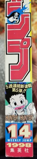
This is the spine of the same fake. Andrew reports that the small Gon looked blurry compared with the cover figure. This photograph is low-resolution, however, so its sharpness is not a reliable reference for judging another copy.
One Piece · Jump 1997 #34
Look at the small face to the left of the O with the red skull. Its eye is missing on the photographed counterfeit; this does not refer to the skull’s eyes. Schwank notes that genuine copies can also have the face or eye partly cropped because centring varies. Compare the whole detail rather than treating it as an automatic rule. [1]
The PDF offers two further checks: darker pink lettering on the fake and, from the side, a slightly projecting interior page on the genuine copy, while the counterfeit’s page edges are flush.
The vertical white line through the E in the logo appeared on early fakes. By his 16 June 2024 update, however, Schwank was reporting counterfeit copies without it. Its absence is not proof of authenticity.
An official 2017 facsimile of this issue also exists. Before buying a “1997 original”, establish which edition is being offered; the distinction is explained below. [4] [5]
Comparing the covers
[1]01 / 01
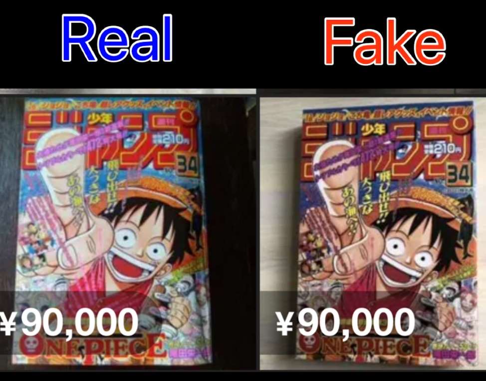
Genuine left, counterfeit right. The identified difference is the darker pink lettering on the fake. The overlaid price belongs to the photographed listing; it is neither an authenticity test nor a current valuation.
The small face beside the skull
[1]01 / 02
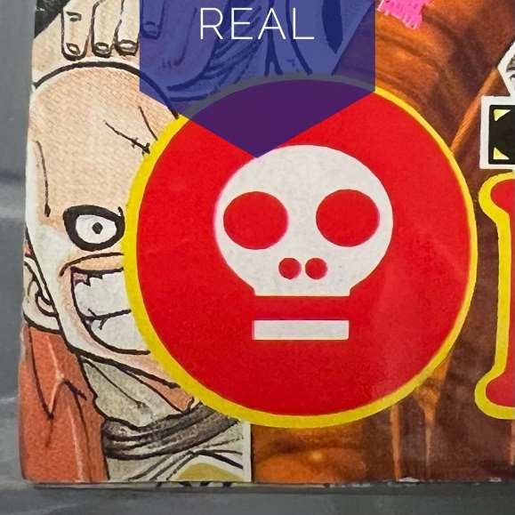
Look at the small face immediately left of the skull-shaped O: its eye is visible on this genuine example. Schwank nevertheless notes that centring varies among genuine copies too and may partly cut off the face or eye.
02 / 02
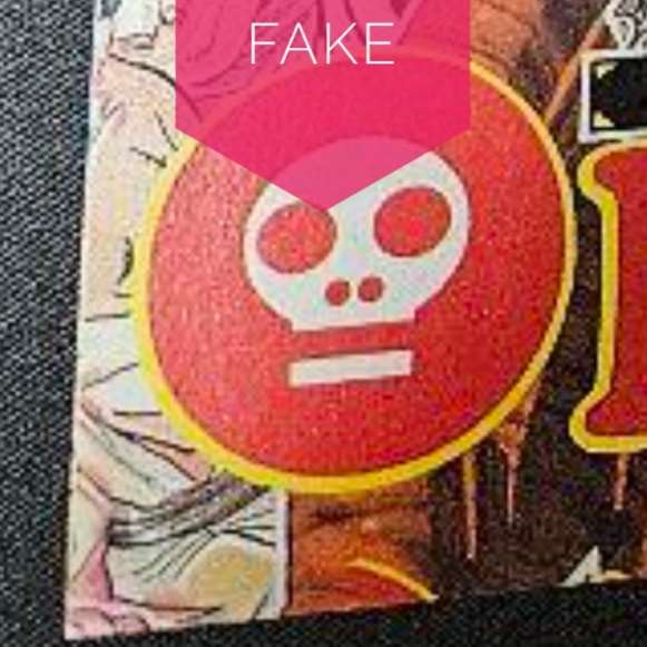
The counterfeit lacks the eye of the small face beside the O. This is not about the eyes of the red skull. Genuine copies can also be partly cropped through centring variation, so compare the whole area and other clues.
Explore page edges and the historical E clue · 3 photos
The interior page projecting from the fore-edge
[1]01 / 02
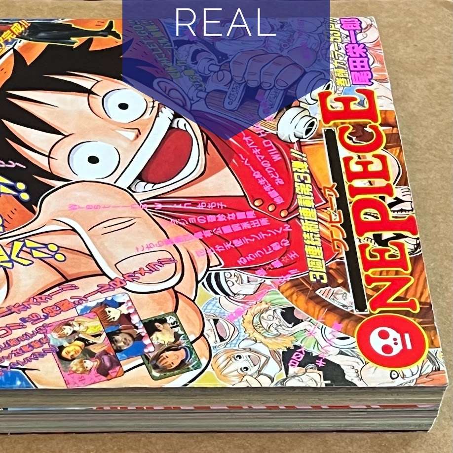
An interior page protrudes slightly from the side of the genuine magazine, as in the Naruto comparison. Look at the page edges, rather than the cover edge.
02 / 02
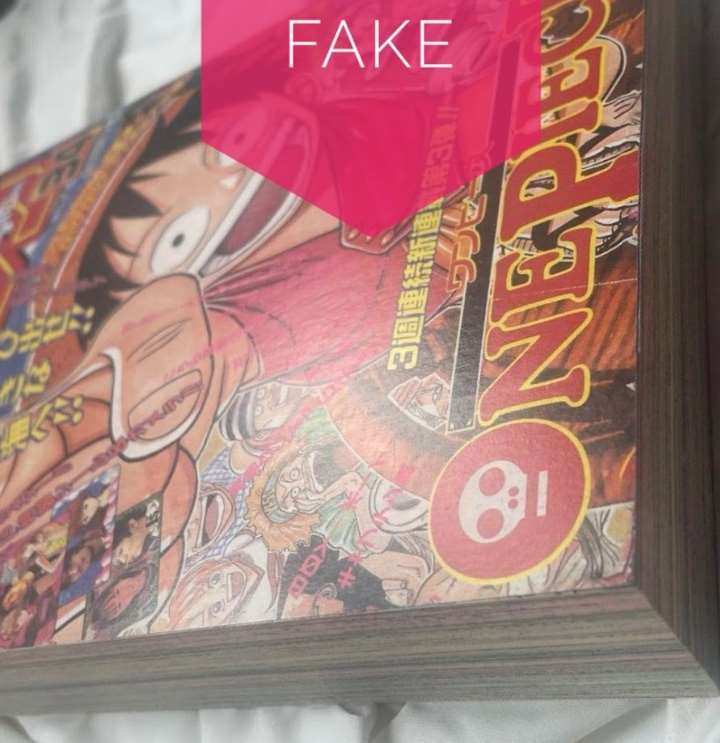
The photographed counterfeit has flush page edges, lacking the slightly protruding page shown on the genuine copy. This comparison concerns this particular Jump issue and should be combined with the cover details.
The line on the E: a historical clue
[1]01 / 01
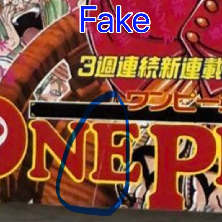
The circle highlights a vertical white line through the E in the ONE PIECE logo, seen on the early fakes Schwank examined. His 16 June 2024 update reports several counterfeits without it, so its absence does not establish authenticity.
Attack on Titan · Bessatsu, 2009
A Hosoemon report from December 2024 concerns Attack on Titan’s first appearance. We could not check the original post photographs. The references are listed below, but we do not yet have a comparison to show you. [6] [7]
If you are looking for this debut, the correct reference is the inaugural Bessatsu Shōnen Magazine, dated October 2009, released on 9 September. The release date can confuse listings: “issue 9” does not correctly identify it. [8]
Recognising official facsimiles
A matching cover does not necessarily mean a fake. In 2017 Shueisha published the Weekly Shōnen Jump Fukkoku-ban Packs, authorised reproductions of historical issues. Pack 2, ISBN 9784081022397, contains 1987 #1/2 and 1997 #34, One Piece’s debut. [4] [5]
You can collect these reproductions too, provided you know what you are buying. The problem starts when a facsimile is offered as the period original. Ask for the internal publishing information and any packaging: the cover alone does not settle the distinction.
Before buying a magazine
- Start with magazine, year and issue number. Then check whether an official facsimile exists.
- Look at the whole magazine. Request the front, back, spine, page edges and publishing information. Staple photographs should not require forcing the binding.
- Request the same details as the comparisons. Goku’s staff, Naruto’s teeth and the face beside the One Piece logo are specific requests a seller can understand.
- Put the clues together. A genuine copy can have wear or printing defects; a fake may have corrected known mistakes.
- If you cannot see it, ask for another picture. A small or blurry image cannot tell you whether the problem lies in the printing or the photograph.
If something does not look right, bring us the photograph and the reference you are using. A remote check cannot always give a definite answer, but a precise question often gets you the missing photograph.
Common questions
Do staples prove Jump 1984 #51 is genuine?
No. The 2022 notice described fakes without staples; later reports describe added staples. Also inspect the cover, interior and construction.
Does the line on the E identify every One Piece fake?
No. It is a clue in some historical copies. Its absence does not authenticate issue 1997 #34.
Is an official Jump reproduction counterfeit?
No, if it is authorised. It should be identified and sold as a reproduction, not as the period original.
Sources, photographs and method
- [1]Ben Schwank · Fake Weekly Shonen Jump · 16.06.2024
Photographic document supplied to the editorial team, 13 pages. 38 images extracted without retouching and reviewed on 16 October 2026: Dragon Ball, Naruto, Hunter × Hunter and One Piece. The complete PDF is not republished.
- [2]Shueisha / Weekly Shōnen Jump · 09.11.2022 ↗
Official warning about pirated copies of 1984 #51.
- [3]Andrew · Obscure Manga · 16.02.2025 ↗
First-hand account of buying a counterfeit 1998 #14. Cover and spine show the fake, not a comparison with a genuine copy.
- [4]Shueisha · Weekly Shōnen Jump Fukkoku-ban Pack 2 ↗
Publisher metadata for the 2017 edition and ISBN.
- [5]Neowing · Fukkoku-ban Pack 2 ↗
Product record listing the pack contents: 1987 #1/2 and 1997 #34.
- [6]Hosoemon · Attack on Titan · 19.12.2024 ↗
Warning post; original images not verified in this research.
- [7]Hosoemon · Follow-up post ↗
Related report; no photographic diagnostic claims inferred without access to the original.
- [8]Kodansha / Magazine Debut · Hajime Isayama ↗
Publisher source on the launch of Bessatsu Shōnen Magazine and Attack on Titan.
Ben Schwank’s PDF reviewed page by page on 16 October 2026. Its 38 photographs have individual explanations; observations remain tied to the specimens and date described by the author. Original photographs and identifications are preserved intact. Tap a photograph to enlarge it. Real means genuine and Fake means counterfeit, as identified by the credited author. The FAKE-stamped cover is an editorial illustration created with AI; the comparisons are real photographs.